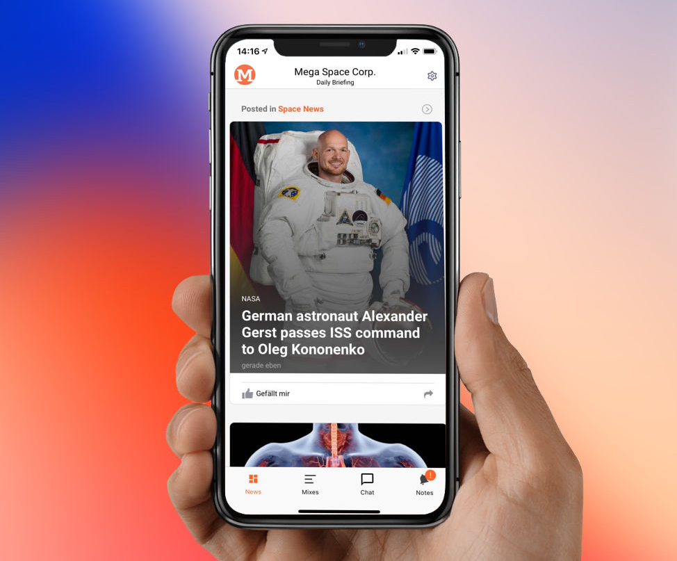
Successful mobile content apps today mainly live from an exciting, current news feed. The user must present relevant content and interesting information to the user in a visually appealing way. A key factor here is the rhythm of uniformity and variety. The content must be quickly and efficiently graspable when scrolling, but it is still important to present editorial content in a varied and exciting way. Finally, this increases the likelihood that users will use the app regularly and intensively.
tchop already offers different templates for displaying the different content types. A mixture of native content such as videos, audio streams, text posts, social media posts or links to interesting content quickly results in an exciting mix for the user. Nevertheless, we thought: especially the teasers for articles and links of all kinds have even more potential.
Therefore, there is now the possibility to choose between three options in addition to the standard display. And to make the presentation of your own content even higher quality.
Big image teaser
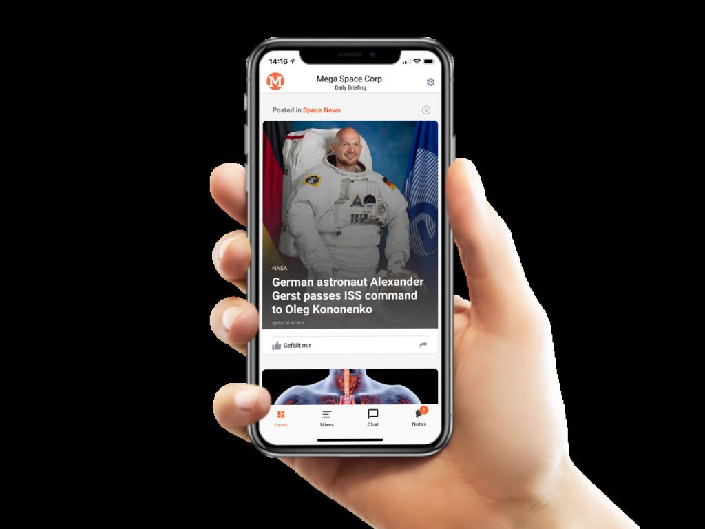
This teaser is especially recommended if you want to emphasize the image with its content. Images with at least one square format are particularly suitable, and even better with a portrait format. Because the headline “in the picture” covers the lower part of the picture (see example). Make sure that the important picture elements are more likely to be found in the upper half of the image.
The intro text of the teaser is not shown in this template for reasons of space. It is therefore important that the headline is meaningful enough.
Small Image Teaser (with intro text)
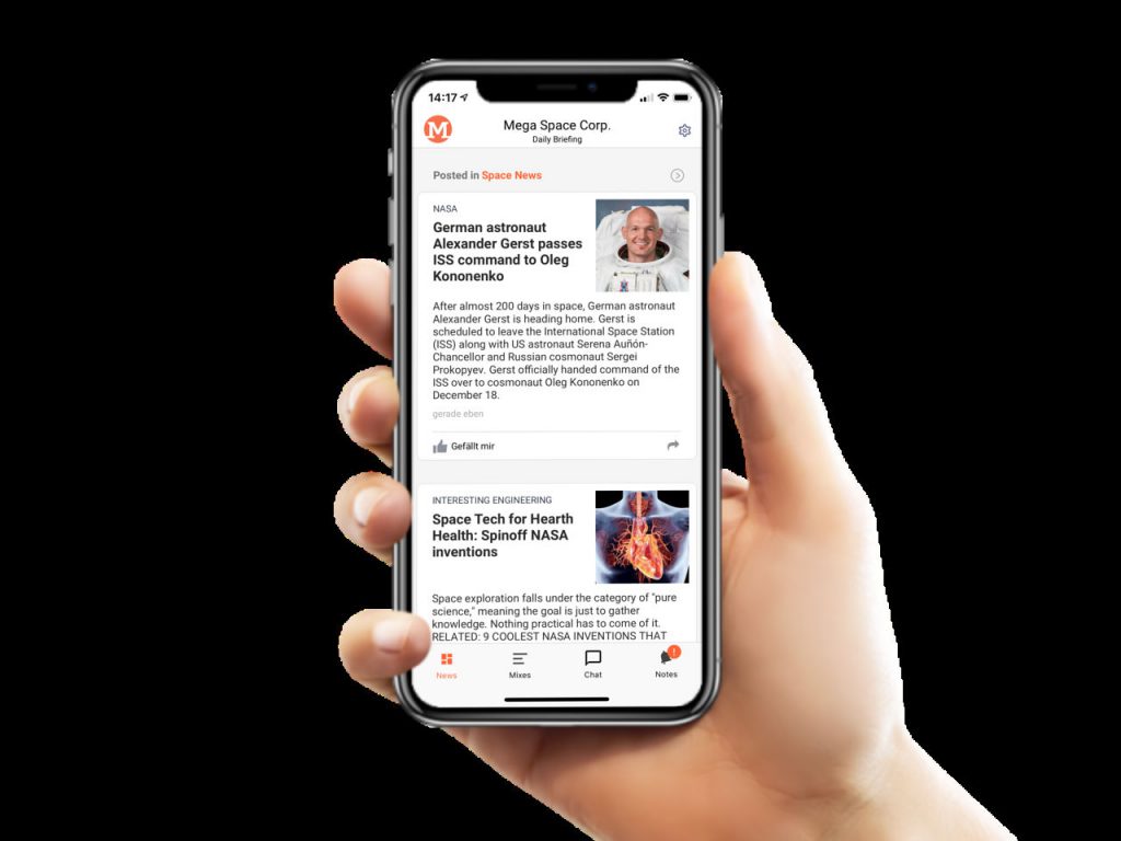
Often there is no high-quality or sufficiently high-resolution image for the teaser. Then you can use a small teaser. This shows the teaser image smaller on the upper right side as a square (see above). A decisive advantage of this variant: more content can be presented on the same area, i.e. the user has to scroll less.
This format is a common and tried-and-tested format for practically all major news offers. In contrast to the teaser with a large image above, it focuses more on the headline and text. It is particularly suitable for standard news in the news feed.
Small Image Teaser (without intro text)
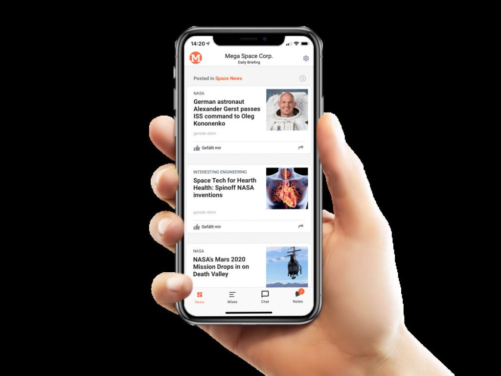
The small teasers are also available as a variant without intro text. This saves you even more space and, as shown in the example, you get three teasers on an iPhone X screen.
Easy setting in edit mode
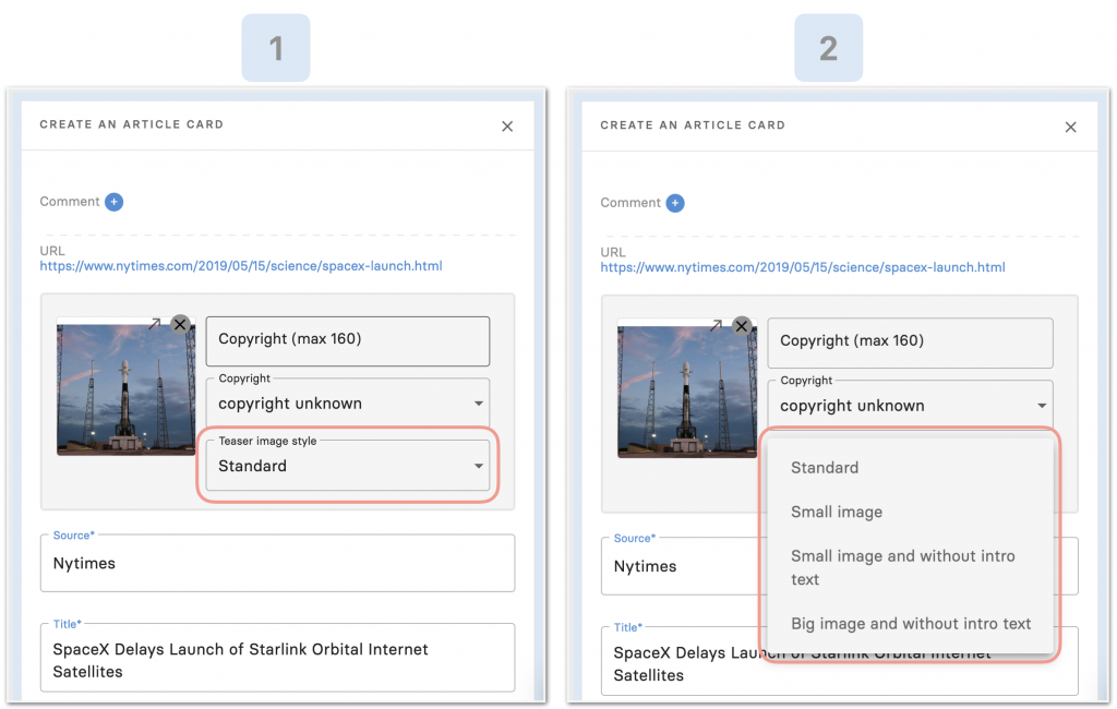
For each article or link teaser with a picture, one of the display formats described above can be selected very easily – either directly when the card is created or at any time later in edit mode. A prerequisite for all these variants is that an image is available. The setting is made accordingly in the gray box in the middle. After saving the card, a change takes effect immediately.
Outlook: automatic use of templates
The possibility of manually determining the display of each teaser opens up many possibilities and is child’s play. However, it is at least as exciting to automate the assignment of the teaser variants – so that the editors don’t have to put extra effort.
There is a simple and very efficient solution for this: a teaser design can be selected in the upper area of the Mix column on the right. After setting the teaser style, all the articles with images will have the same teaser format.
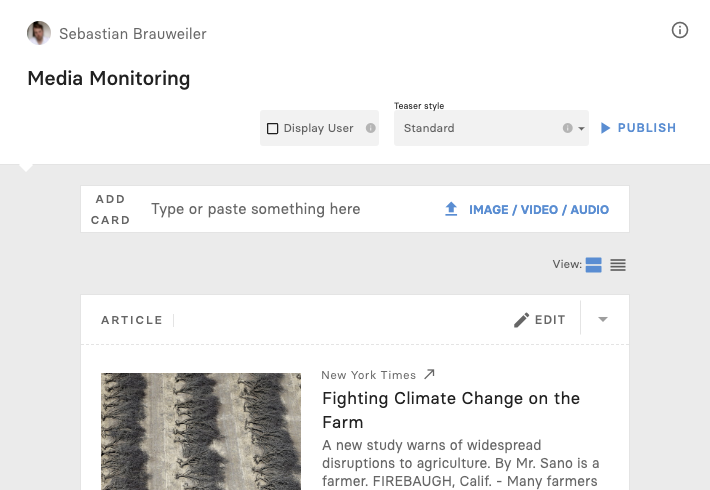
Variety and rhythm can be easily “fine-tuned” without any additional manual effort. The result is a visually highly professional offer, which form the provider’s perspective is both highly flexible and efficient.


