In the early days of digital media, a burst of creativity led publishers and app developers to experiment with various unique and innovative UX and UI designs. The goal was clear: stand out in a rapidly expanding market by offering something new and fresh. However, this golden age of experimentation often faced a significant hurdle – user acceptance.
Despite the creative efforts, it turned out that users preferred interfaces that were familiar and easy to navigate. They gravitated towards designs that made them feel at home, ones they could use intuitively without a learning curve. This preference has led to a convergence in the design of content-related apps and products, which now tend to emphasize usability and familiarity over novelty.
As a result, today’s content delivery and interaction are dominated by three core UI principles that seem to satisfy user preferences universally:
The News Feed
The centerpiece of content delivery, today’s news feeds are highly adaptive, using either algorithms to personalize and present content in a way that engages users by tailoring to their preferences and past behaviors. Or using editorial control to provide a quality feed of owned or curated content by a source that users trust.
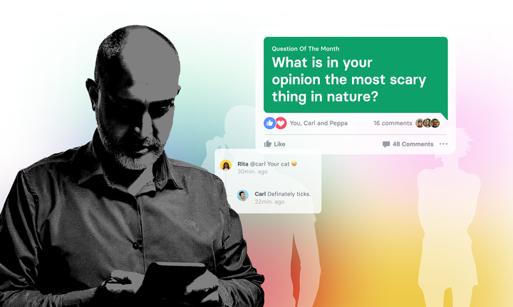
Eventually every homepage is just a news feed of content that a newsroom outputs (with all homepages today looking similar, as they as basically just feeds). But also every instagram or facebook feed wether it’s based on friends you follow or things the algo selects for you is just an endless, scrollable feed.
The Real Time Chat
Far from being just a replacement for traditional email or SMS messaging, modern chat apps are platforms for real-time content and news exchange. They support instant communication and sharing, making them a hub for not only personal conversations but also timely information and multimedia sharing.
But especially Telegram has also established the idea of a read only chat being nothing else then also just a feed of content you can follow (with WhatsApp now copying the idea with what they call “community”). So chats can be feeds, but they also work as the universal interface for any conversation.
Full Page Video
Spearheaded by platforms like TikTok, this format offers a mobile-first, full-screen video experience that allows users to swipe through a personalized feed of videos, enhancing engagement and ease of use. This is a rather special, but powerful case as it embraces the portrait video format that smartphones have empowered.
AI-generated videos will surely fuel this pattern in the future, but it remains only scalable for platforms that are able to aggregate and distribute enough videos (which is something you can only achieve with user generated content at heart).
Conclusion
In light of these observations, publishers and media companies should reconsider their investment in seeking out new UX/UI principles or fancy new design approaches. Instead, the focus should be on smartly leveraging the existing, proven principles. By understanding the strengths and weaknesses of each pattern, they can enhance user engagement effectively. With the full page video pattern being difficult or impossible to scale, especially the chat feature, which is pivotal in human connection, is something publishers and media companies should focus on.
And “focus” really not just means pumping news into chat apps like WhatsApp, but finding ways how to utilise chat communications and patterns into their own digital product propositions. As we navigate the wave of AI-generated content, the importance of personalised, real human interaction only intensifies. There is a huge opportunity in leveraging this from a content point of view.
Notably, AI itself is predominantly accessed through chat interfaces, reinforcing the centrality of this mode of interaction. This strategic focus not only meets current user expectations but is also crucial for fostering genuine engagement in an increasingly automated world.


